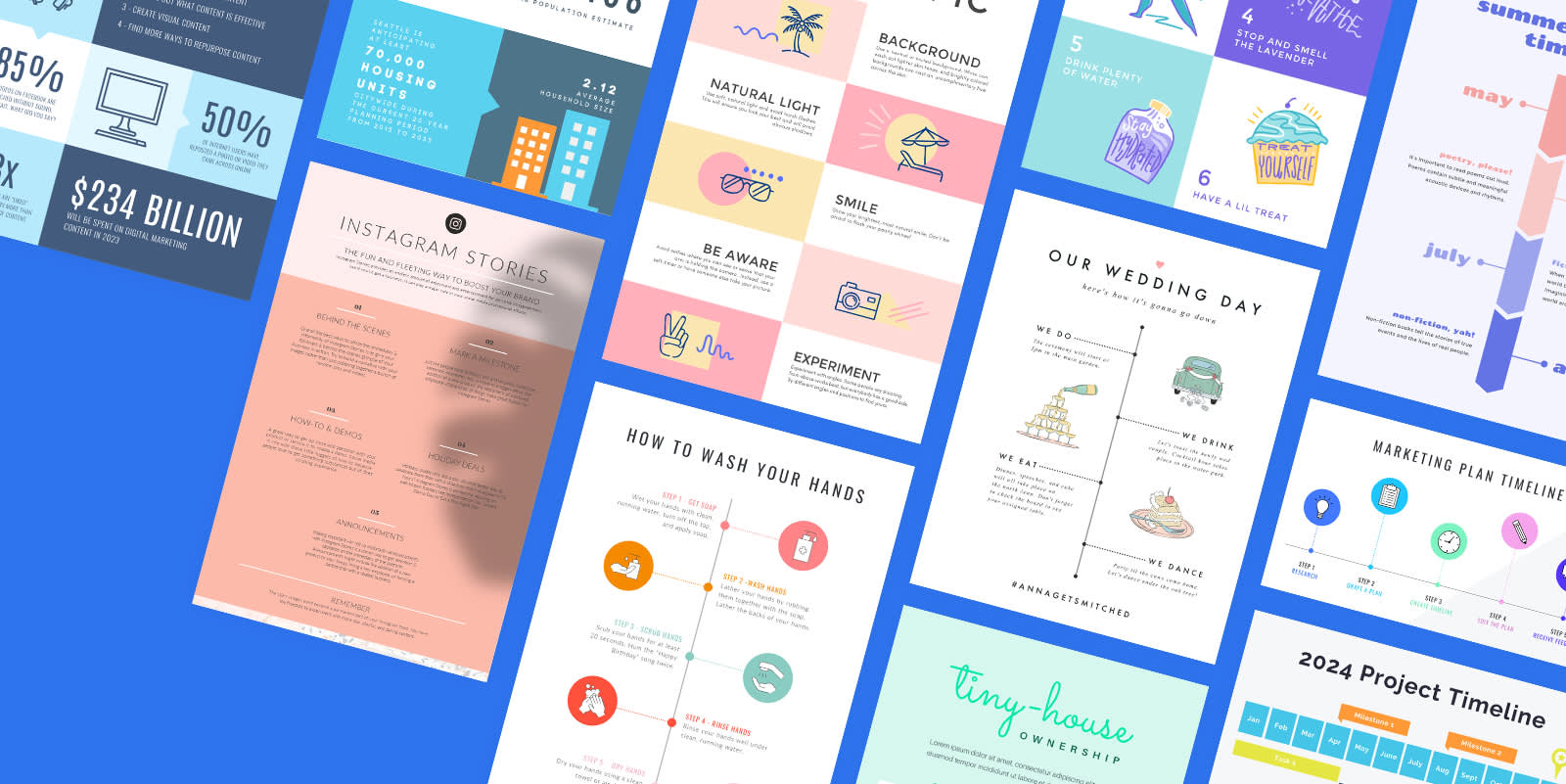
The basic definition of an infographic doesn’t do it justice. It’s so much more than a “visual representation of information.” Try: graphic design juggernaut that makes information sharing easy, accessible, and stylish. So if you came here to find out what is an infographic, you’re in luck — we’ve gone headfirst into the infographic rabbit hole and emerged with a glorious digital compendium of infographic goodies, covering:
What is an infographic?
When should you use an infographic?
Tips for creating infographics
How to quickly make infographics in PicMonkey
Looking for an infographic design fastpass? Try one of PicMonkey’s infographic templates, or jump right into the DIY action with a blank canvas.
What is an infographic?
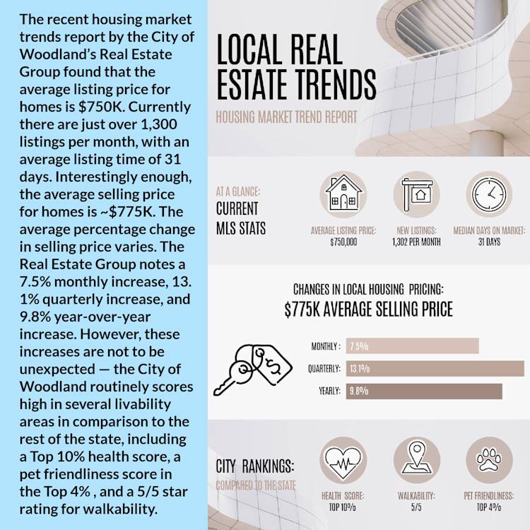
Psst...you can customize the template on the right in PicMonkey
Beyond being a visual representation of information, an infographic is a powerful education tool. When done right, it can engage, educate, and entertain viewers. Consider the above example; both sides say the same thing, but which one is more engaging and accessible?
That’s why infographics rock. It’s not that words don’t matter — it’s just that, as readers (see: bona fide skimmers), we do best with balance. And in the case of infographics, balance equals a healthy combination of images and copy.
When should you use an infographic?
Like any great design, an infographic prospers from intentionality. Consider using an infographic if you want to:
Summarize information in a concise way
Raise awareness around a topic or issue
Provide step-based information
Simplify a complex process
Share data in a visually appealing way
1. Summarize information in a concise way
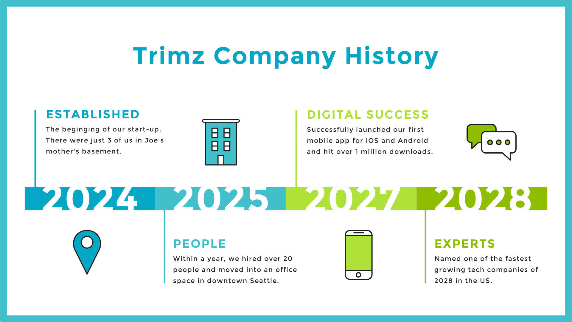
Customize this timeline infographic in PicMonkey
A well-made infographic tells a story. Take the example above, for instance. A much longer story could probably be told, but the design favors concision. Whether you’re trying to tell the tl;dr version of your company’s history or distill a long report into brainfood-friendly points of interest, an infographic does the trick.
2. Raise awareness around a topic or issue

Customize this infographic flyer in PicMonkey
Nonprofit organizations use infographics to raise awareness around various causes and social issues. Brands do this too, often in support of these same causes. Given an infographic’s inherent visual appeal, there’s a lot of opportunity to pair powerful graphic design work with your message.
3. Provide step-based information

Customize this infographic flyer in PicMonkey
Looking for an easy way to ensure your audience actually reads those painstaking steps you dutifully put together? I-n-f-o-g-r-a-p-h-i-c. Especially when trying to simplify complicated steps; infographics are a godsend in this regard. Give the eye something to look at, the mind something simpler to process, and rejoice in the beauty of messaging done right.
4. Simplify a complex process
Customize this infographic flyer in PicMonkey
Perhaps you aren’t dictating a complicated step-by-step process, but you are trying to share the word on something equally as complex? In this case, employ the help of an infographic design. Use only your most important details: those nuggets of information that your audience absolutely needs in order to understand the topic. And it’s worth mentioning — working within the tight confines of an infographic can help you too. If you know you only have X amount of space, you’re much more likely to ‘see’ what is and isn’t needed.
5. Share data in a visually appealing way
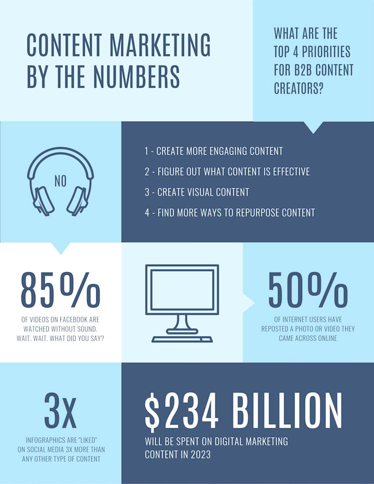
Customize this data visualization infographic in PicMonkey
It’s no surprise that infographics are used a ton for data visualization. No one wants to stare at a bunch of numbers until they feel like they’ve been thrown into the Matrix. Instead, pump those numbers full of color and graphic design.
An infographic’s versatility is why it’s such a Cave of Wonders-esque tool. For marketers. For educators. For small businesses. For social media influencers. For anyone.
Tips for creating infographics
Ready to design your very own infographic? Check out these hot tips!
1. Know what your audience wants
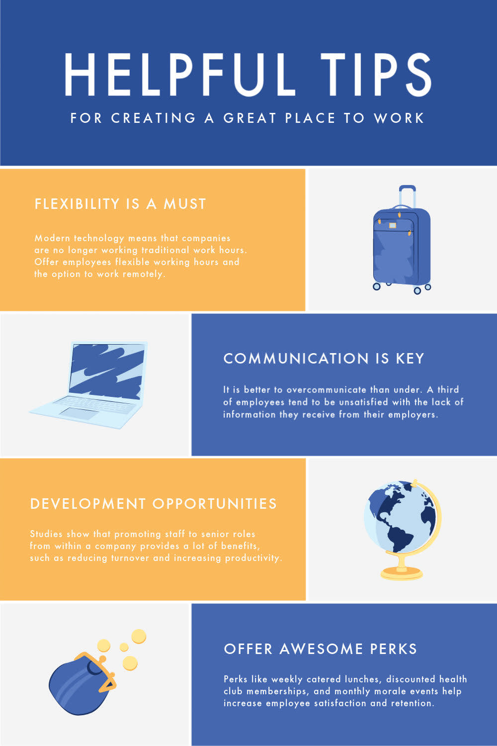
Customize this infographic template in PicMonkey
Speaking to your audience is rule number one. What you do with an infographic doesn’t matter if it’s not on-brand and what your peeps want. Infographics are visual superstars, but no amount of color and graphics will cover up a lack of intentionality.
2. Direct readers’ eyes with color choices
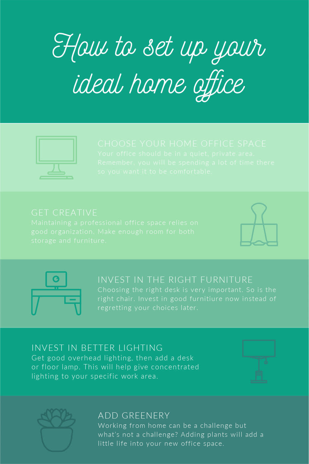
Customize this infographic template in PicMonkey
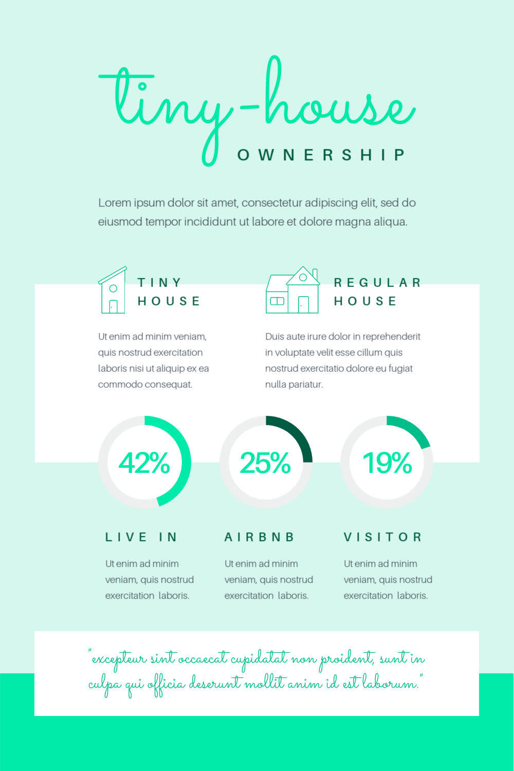
Choose colors wisely and they’ll direct your viewer’s eyes like a Jedi mind trick. There are multiple ways to do this. You can use an apparent contrasting color scheme to guide the eye, or do something like in the above design. The main hue is green, but its tints, tones, and shades (AKA, lighter to darker) subtly direct how to interpret the infographic.
3. Pair fonts for visual cohesion
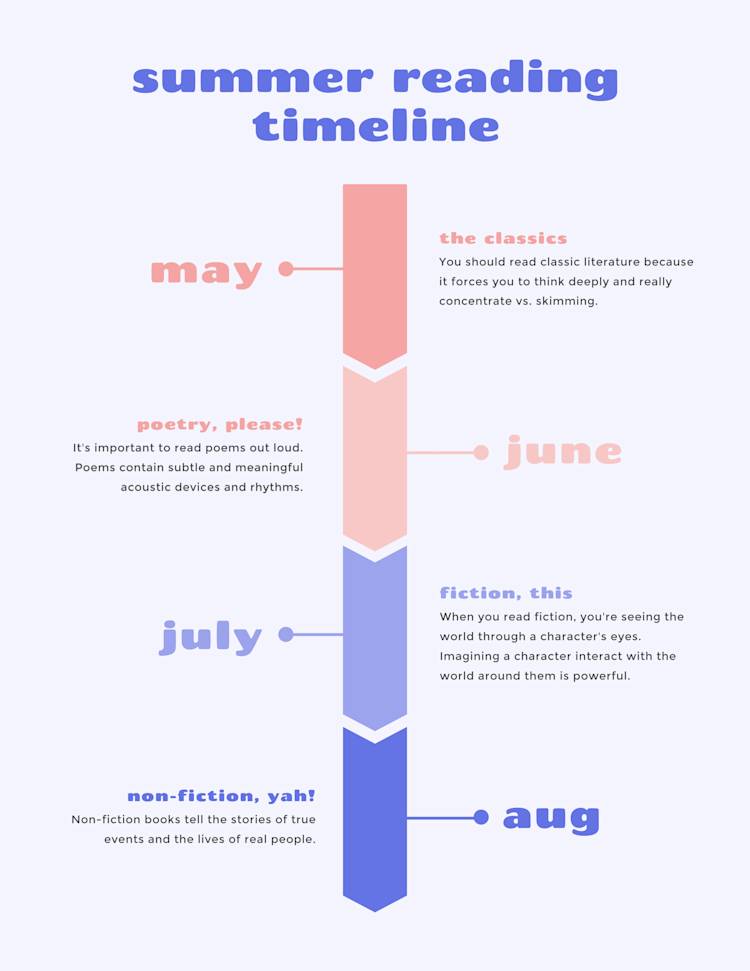
Customize this timeline infographic in PicMonkey
Lots of fonts go together like two peas in a pod. Font pairings achieve two things: intrigue and cohesion. The former gets you noticed, the latter keeps the attention on ya. In our ‘Summer Reading Timeline’ infographic, we’ve paired Chango (a display font) with Montserrat (a sans serif font). The result is a wonderful balance of catchy but straightforward.
Ready to play with fonts? Learn how to use font pairings like a pro, or go straight to the goldmine and check out 30 font pairings for all your designs.
4. Use graphics, icons, and stickers

Customize this infographic template in PicMonkey
Graphics (or stickers, icons, overlays…) can add a little flavor-flave to any design, but they’re even more important in infographics. You’ll be hard-pressed to find many image-only infographics. Lots of symbolism at play, courtesy of fun graphic representations.
When you design your infographic in PicMonkey, you hit the graphics jackpot. We’ve got 1000s of them, all in a wondrous mixture of shapes, styles, and sizes.
5. Add unique twists to the traditional look
Customize this infographic template in PicMonkey
We all have our own idea of ye olde ‘traditional’ infographic, so why not turn it on its head for something jaw-dropping? Especially if you’re making a digital infographic — welcome to the land of extra design super powers!
Assemble your infographic, then bring it to life with animation! In the above example, we used PicMonkey’s Pulse effect to put our graphic into motion, but you can choose from 11 different animation effects and a TON of unique movement variations. All it takes is a PicMonkey Pro subscription.
How to quickly make infographics in PicMonkey
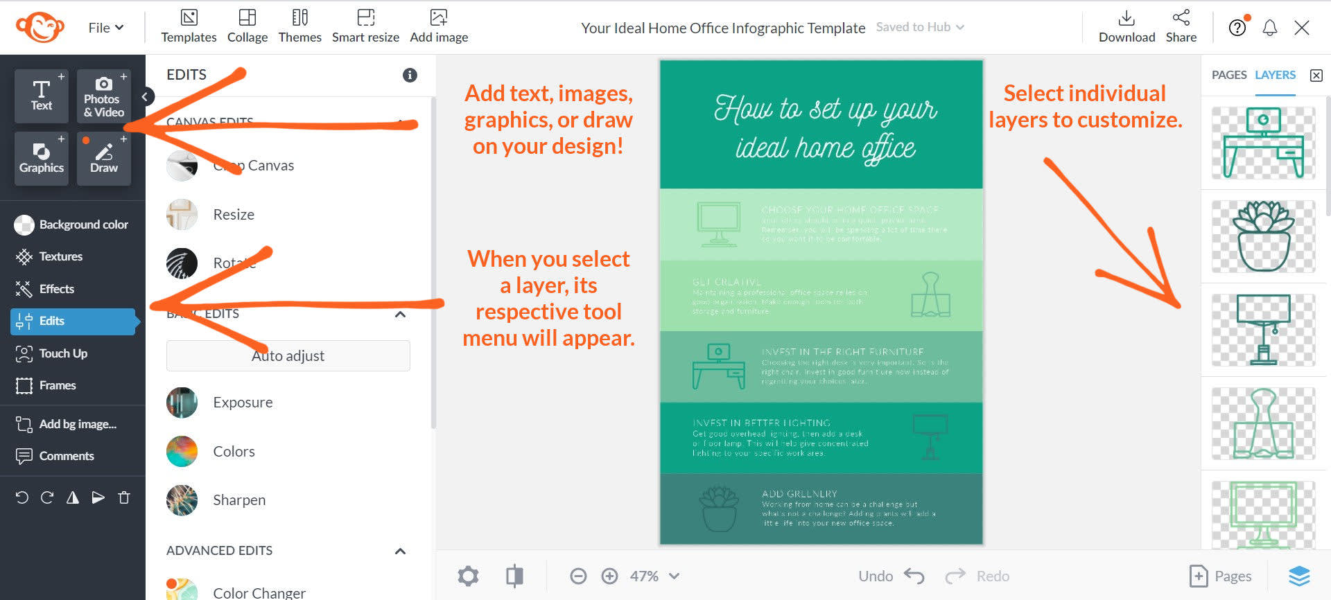
Making an infographic in PicMonkey is crazy simple. After you open PicMonkey, just:
Click Create new and choose either a template or blank canvas.
Customize your infographic with graphics, text, colors, effects, and more.
Download your finished design as a JPG, PNG, or PDF (or an MP4/GIF if you added motion).
And that’s that. Now how ‘bout you get cracking on that next infographic?
More infographic resources
Learn everything you’ve ever needed (/wanted) to know about different types of charts and graphs.
Discover how to turn your infographic into a multi-page design.
Definitively master the art of using graphics in your designs.
Stock photos? Browse our stock photo library for everything you need.
