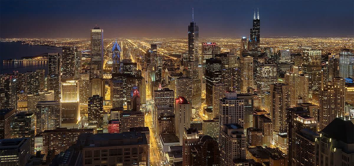
Chicago skyline.
Landscapes are my choice of playground when I go to shoot, but recently I tried my hand at photographing architecture and had a ball. Architecture shares similar compositional attributes with photography, so your subjects intrinsically have really good photo elements in them—you just have to find them! Lines and shapes are typically stark, shapes have been designed into the buildings, and patterns are everywhere.
Architecture is also easy to shoot. Walking to lunch? Grab some phone shots. Business trip? There might be some historical buildings near your hotel or office. Family vacation? Likely someone has had a design eye trained on the area you’re staying in. Here are some ideas to get you going with architecture photography.
Leading lines
Lines are everywhere in architecture—beams, edges, window frames, columns, you name it. But lines are best when they lead your eye somewhere or create repeating patterns (see below).
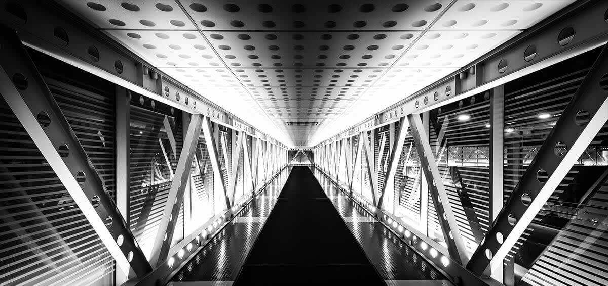
Underground walkway, Chicago. Leading lines to the end of the hallway.
Skylines are lines, too. Standing next to each other, differently sized buildings create an outline that the eye distinguishes from the sky to make a recognizable contour.
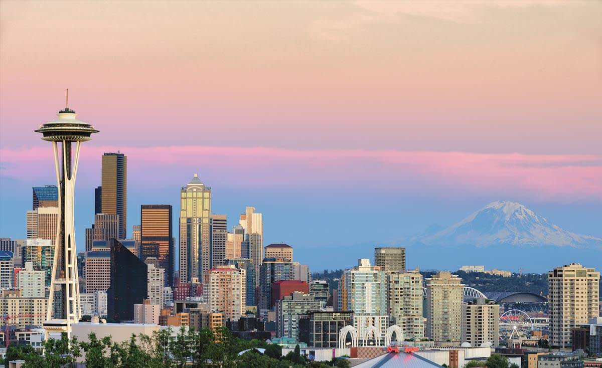
Seattle skyline from Kerry Park. The Space Needle starts a diagonal line down to the right.
Shapes
Architecture is a whole creative field in and of itself. Architects are artists. One of the most unique buildings in the world is the Aqua building in Chicago, designed by Jeanne Gang. The balconies are shaped differently to create a wave pattern along each side of the building, and differently colored glass is used in the negative space to give an overall impression of a waterfall flowing down the side of the building. A straight shot of this building is almost preferred to a zoomed-in shot, in order to give the entire context of this feat, but this more cropped shot was my pick because there weren’t any good clouds that day.
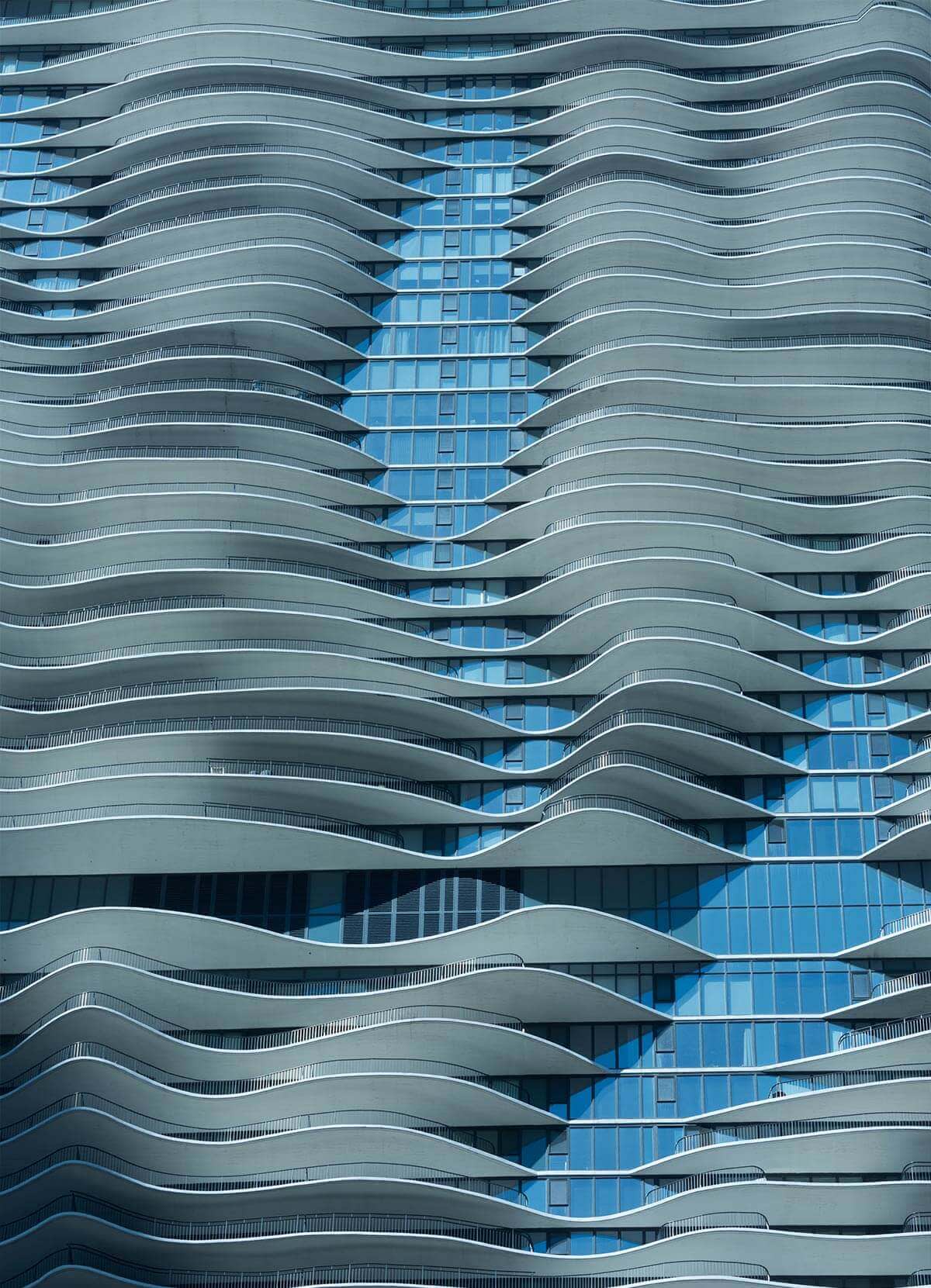
The Aqua building in Chicago, designed by Jeanne Gang.
In contrast, the Experience Music Project in Seattle is a folding metal design that’s much better seen in an abstract way than as a whole. Each angle brings a different overlapping shape to the image, and walking 10 feet in one direction or another changes the composition drastically.
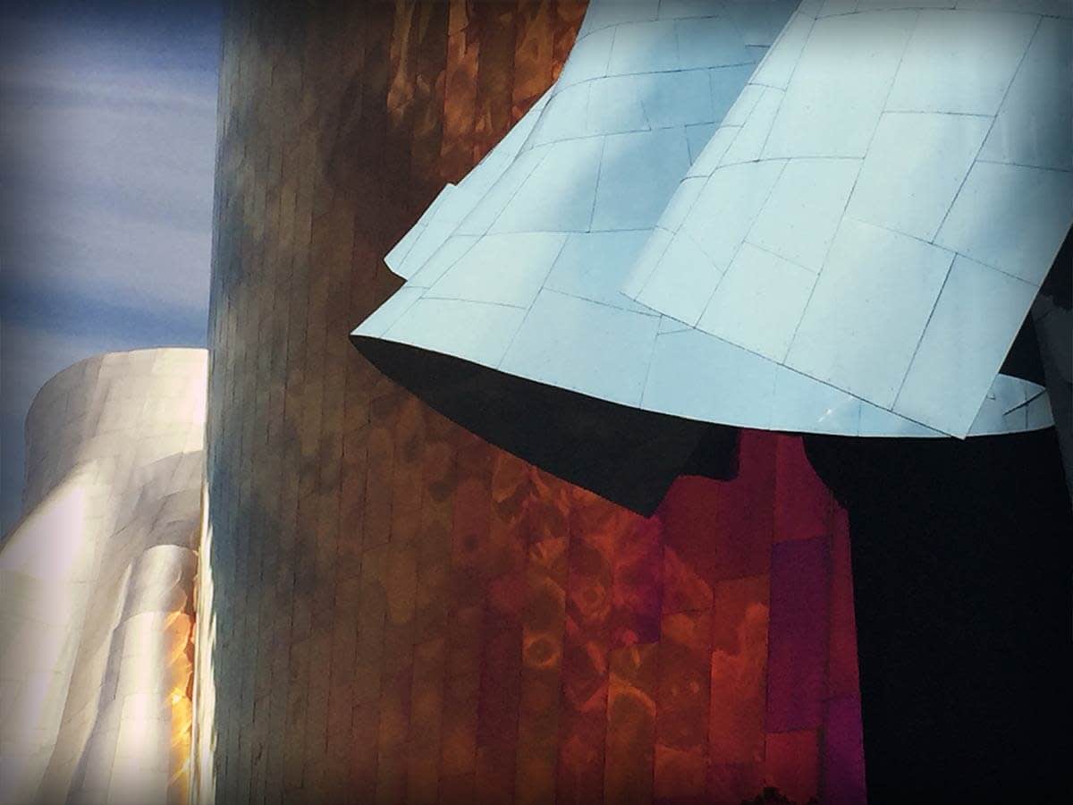
EMP building by Frank Gehry, shot with an iPhone and the soon-to-be-released PicMonkey mobile app. End shameless plug.
Repeating patterns
Lines and shapes help create patterns. Repetition is wonderful, and can make the eye wander through the scene. Staircases are especially fun to shoot, as the repeating patterns of the steps combine with the curves in the staircase to lead the eye.
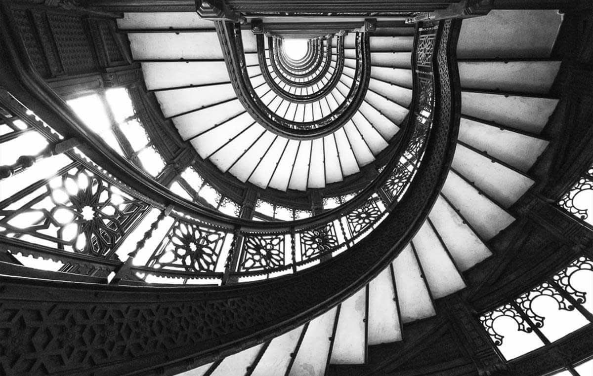
The stairs in the Rookery building in Chicago.
Reflections
Buildings have windows, and sometimes these windows are architected to give interesting reflections as the light changes. Water is also a fantastic reflector, and when skylines and water are combined at night, you can get some very pleasing images. The below image is a 6-shot panorama of the Chicago skyline taken near the observatory. While the light reflection in the dead of night can be great, the sky may not be super interesting unless you’re shooting for stars, or low-streaking clouds.
A nice color in the sky usually happens around blue hour, which is between sunset and civil sunset end (a great tool for learning what time these hours start is The Photographer’s Ephemeris). To get some of the blue hour in the sky, this was taken about 10-15 minutes after sunset, perhaps even a few minutes too late! An exposure of about 15 seconds ensured the water blurred into a smooth texture to accentuate the reflections.
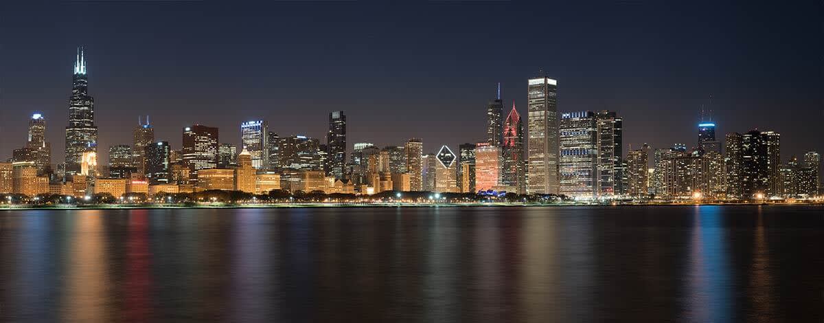
Reflections at night, Chicago skyline.
Black and white
In landscape and portrait work, going black and white usually gives the image a classic or artistic look that can really make it pop. When shooting architecture, black and white can similarly accentuate the starkness of the lines, obscure some unwanted lighting or colors, or just generally clean up an image. The underground walkway from above was fairly interesting in color as the light was yellow, but I found the carpet unflattering and difficult to overcome. In black and white, it becomes a more consistent background and helps lead your eye down the corridor.
The sky didn’t have any clouds and little color when I visited the Cloud Gate statue in Millennium Park in Chicago. Boosting the saturation in PicMonkey or using an effect like Orton made the result too fake. Converting it to black and white gave it a more straightforward appeal.

Dawn at Cloud Gate in Chicago’s Millennium Park.
Motion
There’s a lot of motion you can shoot in cities, inside crowded areas, or around buildings. You can show clouds streaking across the tops of buildings, blurred people can “ghost” through the image, and the taillights of cars can form pleasing curves of red and yellow streaks. For streaking clouds or ghosted people, long shutter speeds of anywhere from 4-30 seconds (or longer) can give you cool effects. Shooting car light trails is similar to shooting water, and all the techniques we talked about in our blog a few weeks back apply (check out the article about water photography for more information).
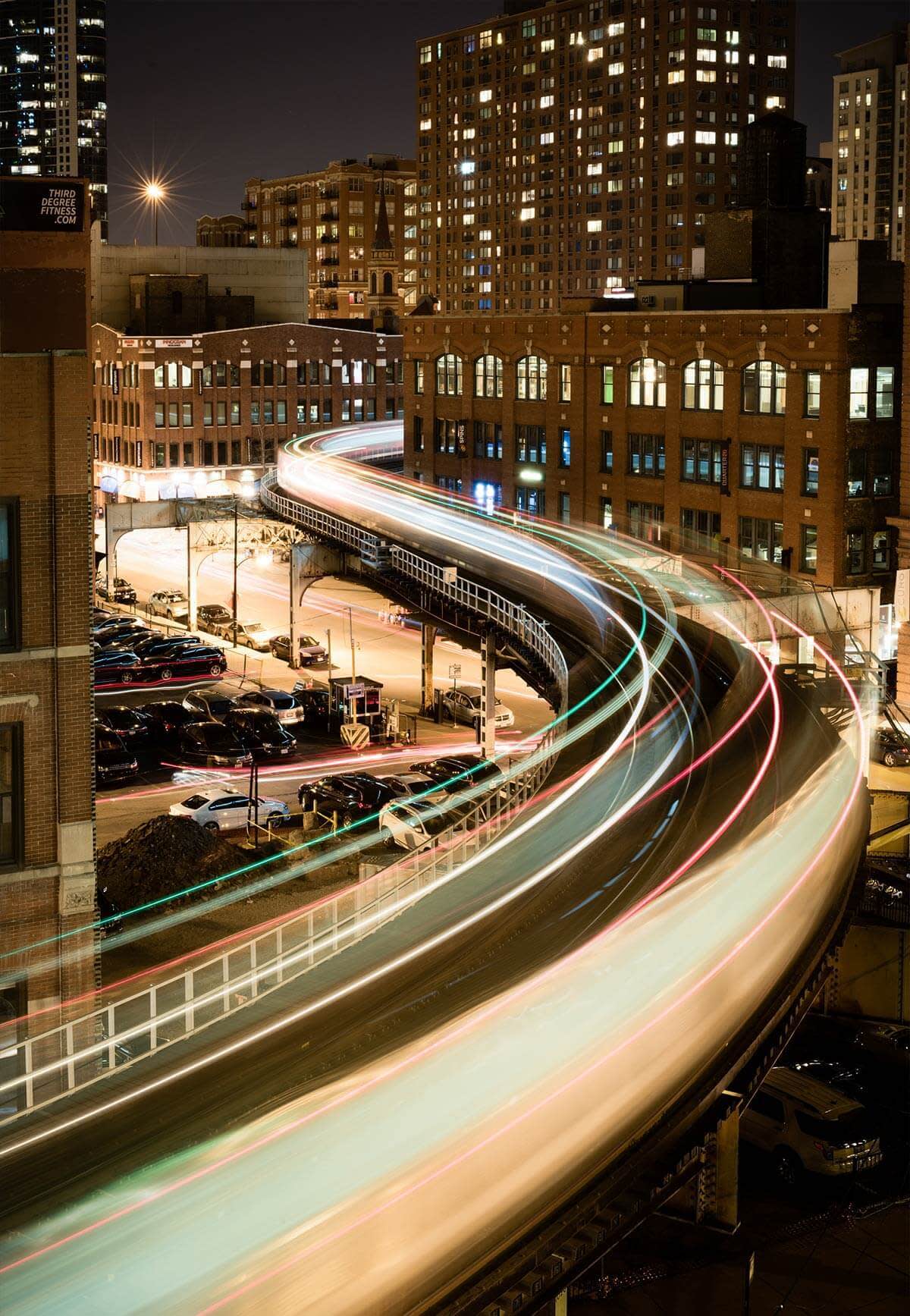
Chicago L-Train: Light trails from a passing train streak in curves. 2 second exposure.
Abstracts
I enjoy shooting architecture as abstracts more than any other way, by far. Anything that can make people look at a photo and ask “what the heck is that?” feels very interesting. I’ve developed three go-to techniques. The first: I use a long lens and zoom in on a building, sculpture, or urban scene. The below picture of a wood sculpture (also by the aforementioned Jeanne Gang) was shot at 300mm to pull out the fanned nature of her overlapping wooden panels.
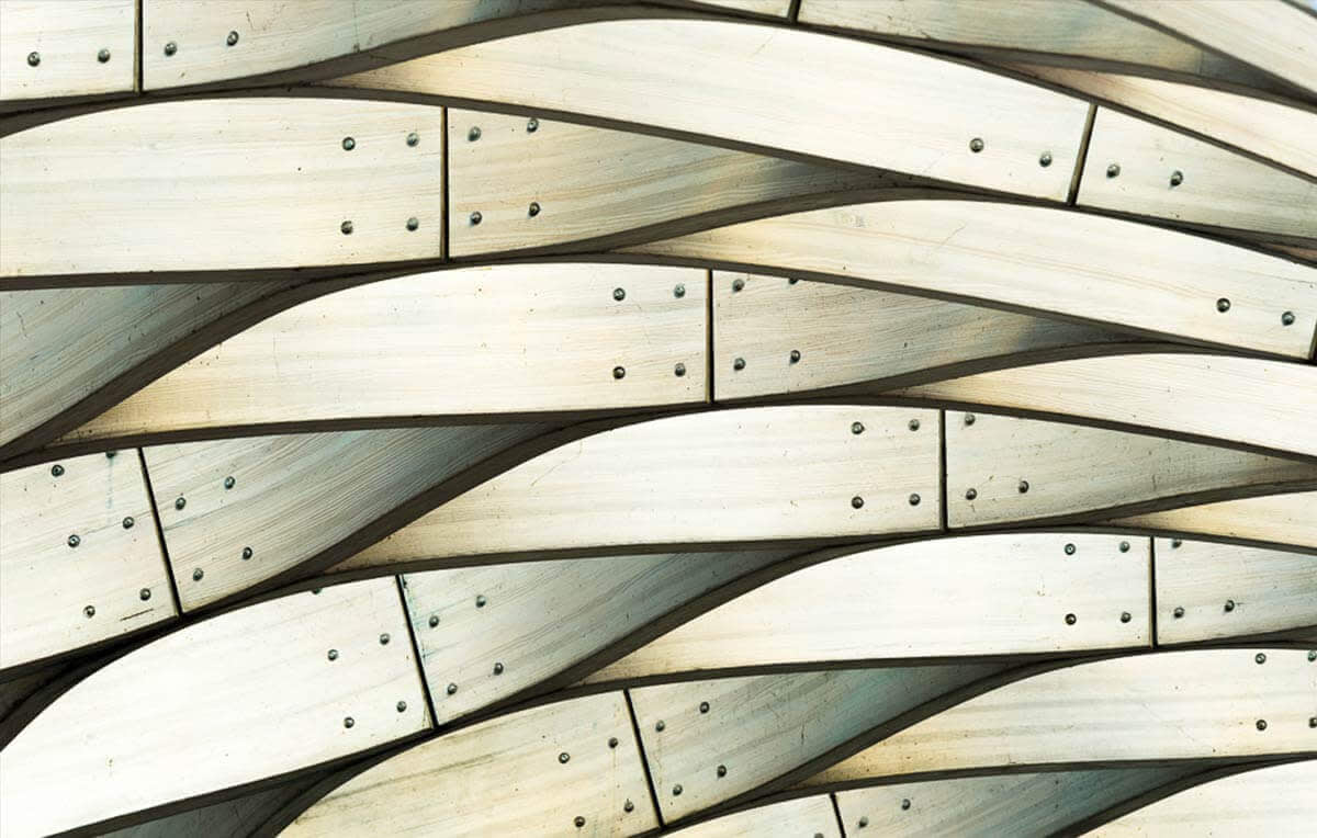
Wood Pavilion at Lincoln Park Zoo in Chicago.
The second technique involves using PicMonkey to convert to black and white, and then absolutely hammering the contrast to get a stark difference between the highlights and shadows (you can do all of this in the Super B&W effect, or convert using a different black and white effect from the effects tab and then adjust the contrast with Exposure in the Basic Edits tab). Before you read the caption on the photo below, see if you can figure out what the subject is.
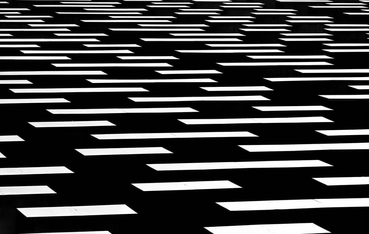
Apartment balconies shot in stark sunlight and then overprocessed to abstraction.
Multiple exposures
Some of the more sophisticated DSLRs have a built-in “multiple exposure” functionality. You can get a similar effect by opening your image as a graphic in PicMonkey, rotating each slightly, and then playing with the blend mode options in the dropdown menu on the Graphic palette.
But the in-camera way is much more fun and immediate. Put your camera on a tripod and zoom in on a particular area, then do a 6-10 shot multi-exposure and rotate the lens by 30-90 degrees, depending on the desired effect. The camera will then overlapp the images into one shot, creating fantastic results. If you look closely, you will see the “fanned” areas are actually buildings.

“Ecoute”—The Flamingo Statue in Chicago, 8-shot in-camera multiple exposure, Nikon D810.
Final thoughts
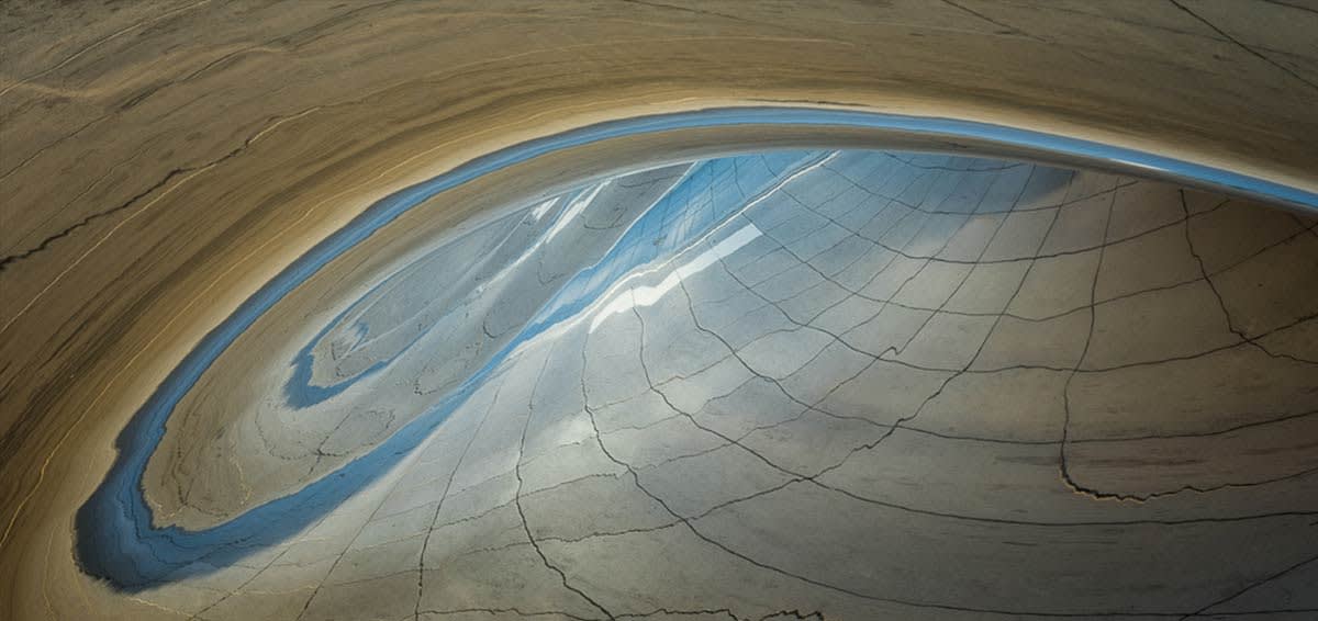
Cloud Gate Abstract —Reflections in the Cloud Gate sculpture at dawn.
Architecture provides an endless experiment in composition and it’s easy to get into. It’s also easy to keep simple, like shooting skylines and patterns, because the architects and planners have lined things up for you. You can also get super creative with things like light trails, abstract black and white, and multiple exposures. And there are more techniques to explore, like straightening lines when shooting perspective, and using tilt-shift lenses to create quick and easy panoramas, to name a few. But above all, architecture is an easy way to train your eye to see—which is arguably the most useful technique we photographers can learn.
