Making apps is generally less messy than making, say, sausage. For instance, if all goes well, nobody gets put through a grinder (except maybe metaphorically). And also unlike making sausage, making apps can be fun to watch and learn about, rather than a grisly truth you hide from children.

Frits Habermann, our Chief Technology Officer (and Pied Piper of Product), sat down with us to talk about making the PicMonkey app, why it is what it is, and what kind of fun you can have with it. Here’s what we learned.
Back to basics

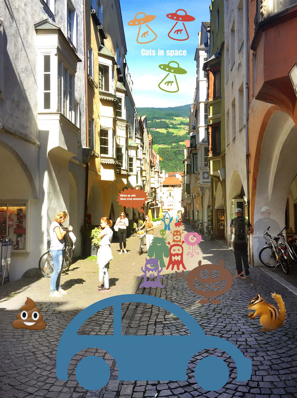
A straightforward alley in Italy converted into a different story using PicMonkey’s stickers.
Because PicMonkey is a lot of things to a lot of people, when it came time to build the app, we had some choices to make. Did we want an app that focused on the fun of communicating with loved ones? The ready-for-the-spotlight glamour of touch-up? What about advanced features like Clone or Curves?
Habermann says the key for us was beginning with a “fundamental photo editor.” This first version of the app is a cornerstone: super easy to use, with a solid menu of features we can build out in many different directions.
“This is the beginning of many iterations that all provide a very creative platform for people moving forward,” Habermann explains. How do we get there? That’s where you come in.
Yes, you. Reading these words!
When asked to describe the path he envisions for the PicMonkey app, Habermann replied: “Start simple, listen to our users, gather feedback, and iterate.” (Iterate’s a fancy tech word for “make a version.”) That means we’re very much listening to what you guys have to say about the app—what you like, what you don’t like, and what you’re patiently anticipating—to guide our next steps.
In the meantime, we’ve infused our first-round PicMonkey mobile app with our singular simian DNA: a no-user-manual-needed easy interface, flexible workflow, and some loopy text to make you smile.
“A lot of apps are super dry,” Habermann noted, with what may have been a hint of secret amusement.
The joy of painting (on and off)

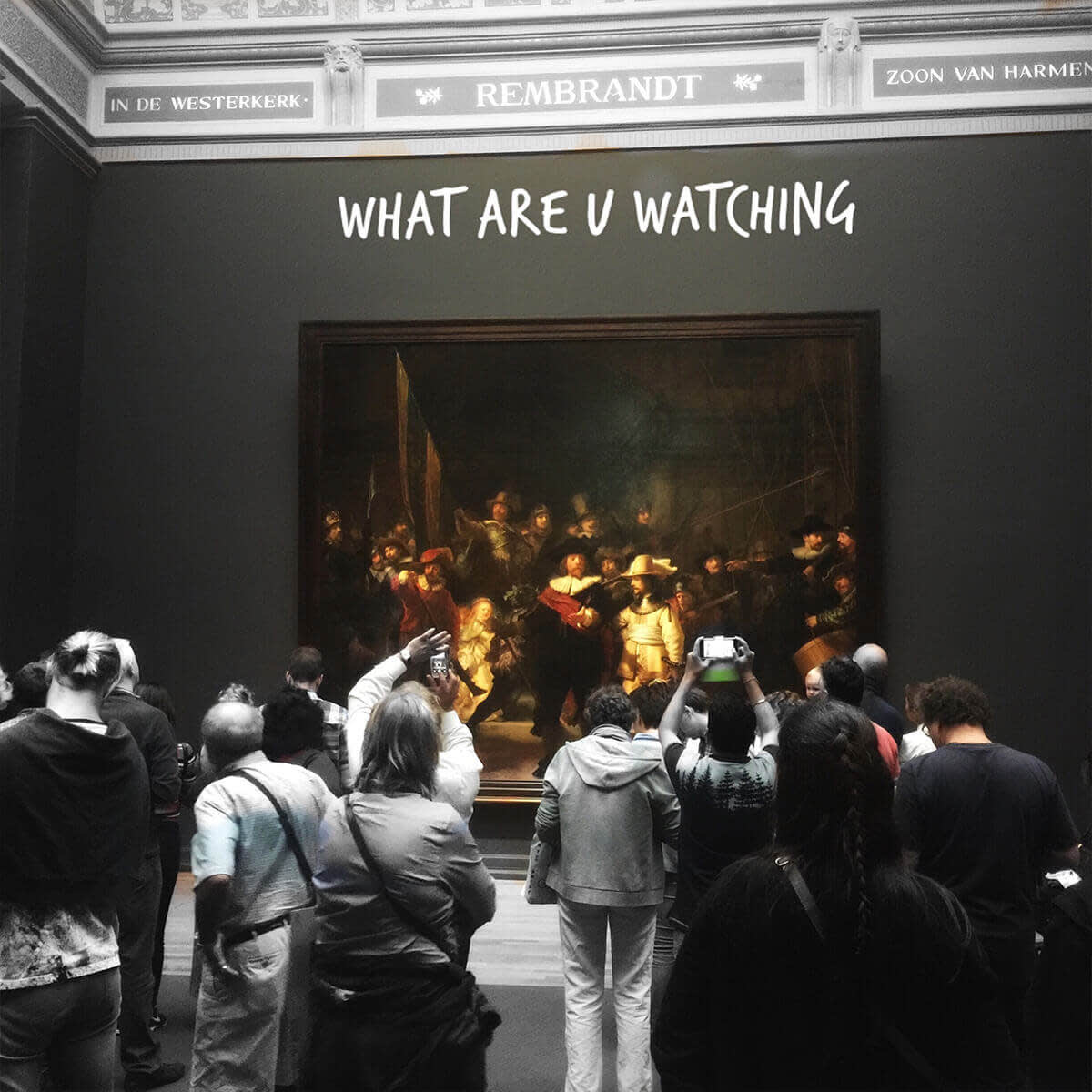
Rembrandt’s “The Night Watch.” Artistic liberties c/o the PicMonkey mobile app.
When we asked Habermann for the mobile app’s standout features, he was quick to cite painting photo effects on and off as “fine art on a phone.”
“Drawing on and off effects suddenly exponentially increases the type of creativity you can have.” Habermann uses this ability in so many ways it’s hard to keep track of them all, but here’s a few highlights of how he uses paint on/paint off:
Add vibrancy to a specific spot by painting an effect like Boost onto it.
Paint colors on and off—which Habermann used on a black and white image of a Venetian building. After he turned the whole image black and white, he erased the effect from one tower, resulting in a red highlight in the otherwise monochrome photo.

Sneaky touch ups. This is some next-level stuff, but Frits revealed to us that you can selectively apply Soften to a person’s face as a sort of on-the-go Airbrush tool. This blew. Our. Minds. “You can also get teeth whitening with painting on the black and white effect and playing with opacity to get the color just right,” he added. Boom. Minds blown.
Habermann has also found a lot of delight in creating mobile images to share with family. The text and stickers features make it easy to craft a personal message or inside joke—basically, to make a photo say more.

Frits says, “Picmonkey’s Blur, slight Boost, and slight Orton applied to photo of my daughter’s stuffed animal ‘Duke’ in Burano, Italy.”
Let it (work)flow
A quick note about Frits: In addition to being an awesome CTO, he’s a seriously skilled photographer.
Like he’s really

really

ridiculously

good.
So when he told us that the PicMonkey mobile app has already changed his own workflow as a photographer, we were like, “Say whaaaaat? Shut the back door!” But we were only like that, because we want Frits to like us and think we’re cool. What we actually said was more like, “How fascinating. Can you explain how that works?”
One way it works is by adding flexibility to his workflow. Some apps, Habermann pointed out, put the user on a conveyor belt: crop, apply effect, share. In contrast, PicMonkey mobile’s free-wheeling workflow lets every individual discover how the app works best in their own life.
For Habermann, it’s helped him location-scout and brainstorm his next photographic endeavor. Since his phone is always in his pocket, he’s found himself using PicMonkey to take “rough draft” shots, then making basic edits to see where the final image might end up. “Suddenly you’re trying things you wouldn’t normally do,” he told us.

Frits says, “Photo shows painting on black and white while scouting a location. Gave me sense of composition, what black and white for mountains can look like, and if the recent hail storm could do anything for the shot. Then I added some stickers to send to the family.”
Try, try again
If Habermann could give you all in Internetlandia just oooone piece of advice to transform your mobile app experience, he would actually give you two pieces of advice. He’s the CTO and it’s his prerogative.
First: “You need a couple of times to just try out different things.” If painting on and off isn’t achieving what you want it to, don’t give up after one attempt; use a different photo or a different effect. Zoom in a little further. Creative genius requires experimentation, after all.
Second: Try Hub! Like the app itself, Hub has simplified Habermann’s workflow in sometimes-surprising ways. He pointed specifically to how much easier it is to take and edit photos within a single ecosystem, but added that Hub, like the app, is a foundational tool that could grow in many directions.
“Hub is a blue ocean,” he zen-koaned.
And so we descended from the remote mountain temple where Frits had requested we hold our interview, richer in app knowledge and afloat on an ocean of possibilities. We hope you are too.
