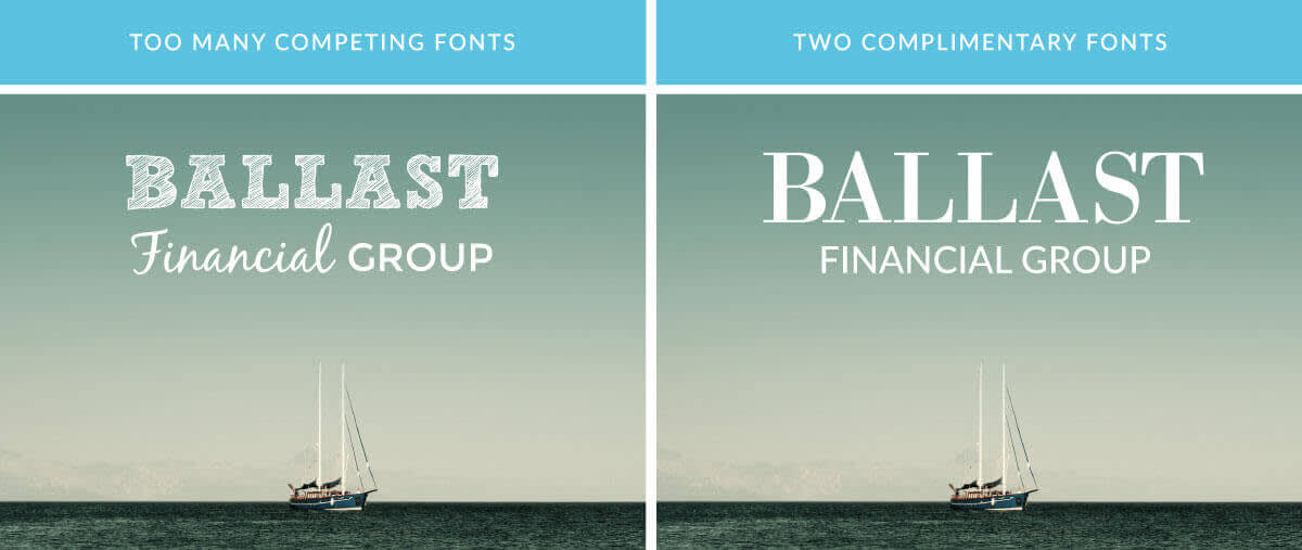
Fonts are a powerful tool for defining your brand and making it instantly recognizable. Think about any big-name brand, and you can probably envision its name displayed in a very specific way—like Coca-Cola in its swirly red font or “Time” magazine in its super-sophisticated serif font. Choosing fonts and using the same one (or few) consistently creates a unified look and makes your brand easily recognizable, which is why it’s important to give it some thought and pick the best fonts for your business.
So how do you choose fonts and use them to create beautiful, on-brand assets? Take a look at the following quick tips from professional designers, and you’ll have a much easier time finding professional business fonts that perfectly fit your brand.
Choose up to two business fonts

To help keep your brand recognizable (and your designs from looking messy), avoid using more than two fonts. Consider choosing one for titles and headlines, and another for any body text. Take a look at your favorite brands and notice how many fonts they use, and how they use them. Some brands—like Apple—stick with only one font at a time.
Serif and sans serif

When you venture into the world of fonts, you’ll likely come across two terms: “serif” and “sans serif.” “Serif” refers to those little feet and tails at the end of letters, like you see with Times New Roman. “Sans serif ” means without serif, so no tails or feet.
Sans-serif fonts are generally easy to read and the letters stand out from one another nicely, which is why they’re a top choice for text that’ll appear on screens. Serif fonts have a sophisticated feel and can lend a classy look to your communique. A good way to combine fonts is to use a serif font for titles, and a sans-serif font for the body text. For more ideas on how to make both kinds of fonts coexist, check out our articles about font pairing and design tips for non-designers.
The squint test
There are tons of marvelous fonts available, and PicMonkey has a bunch ready for you to use—including some calligraphy-inspired marvels. These specialty fonts make for gorgeous logos, but think twice before you draft the body text of a document or marketing piece in a super curly cursive font.
Draft a couple of documents before you make your final font decisions, then print and share with your friends. Pay attention to their faces as they read. If they squint or furrow their brows while looking over your documents, you probably have readability issues and should reconsider your business font choices (no matter how scrolly and pretty they are).
Colors and professional business fonts

Titles on marketing materials may be colored, but avoid using colors on the body text and stick with black or dark gray. You might occasionally use white to contrast with a background image, but make sure it passes the squint test. And think about your color-and-business-font combinations—if you use magenta or green text with Comic Sans, your marketing materials will end up looking like the email chain letters your aunt is always forwarding to you.
Appropriate silliness
Fonts have the ability to create feelings, and it’s important to choose professional business fonts that keep with the vibe of your brand. For example, PicMonkey’s Sinister Scrawl and Undead Text fonts feel a bit spooky. These are great options when you’re creating materials for specific holidays or events, but you probably won’t want to use them in your everyday documents unless they strongly relate to your business.
Finding ideas and business fonts
You can find font-spiration all over the place! Conduct an image search for “professional business fonts,” or take to the idea wonderland known as Pinterest. Pay attention to combinations you see in window displays, advertisements, and magazines, and snap some pictures to keep track of your inspirations.
Many artists sell font combinations, and there are a number of fonts available from free resources. Just make sure to check the permissions for any font you use.
PicMonkey also has a number of fonts available for your business designs, and you can find them in the Text tab of the Editor. Not finding what you seek? Any fonts you have installed on your computer will show up in PicMonkey in the Yours tab of the Text tool.
