Building a fabulous brand is great and all, but it doesn’t do you a whole lotta good if nobody knows about it. That’s where advertisements and promotional images come in. They say “Hey! Look over here! Give my brand a try!” and get the word out about you, as well as any specials or other incentives you’re offering.
Aesthetics play a huge role in establishing trust and credibility, so if your advertisements and promotional images don’t look professional, you’re probably not going to get the results you’re hoping for. Here, we’ll look at three ways to make polished promotional images and advertisements with PicMonkey, with some general best practice tips sprinkled throughout.
Plan your ad based on location, audience, and brand
Before you dive into designing, consider these three things:
Location. Where your design is going to appear has a humongo impact on what you create, since many sites have rules about image size, character limits, etc. Most websites list fairly detailed image and ad guidelines. Here are a few helpful resources:Google ad format gallery/templatesFacebook and Instagram ads guideTwitter advertiser creative specifications
Audience. Remember those good ole brand moodboard-making days, when you did all that thinking about who your ideal customer is and what they like? Put that to use! This will influence the images you select and the language you use. For example, “On fleek” probably isn’t gonna be the best copy choice if your customer base is older than 25.
Brand. Your ads and promotional images should look and sound like your brand. If they’re a complete departure from your usual style, potential customers may think they landed in the wrong spot when they visit your website or social media pages.
How to design advertisements and promotional images
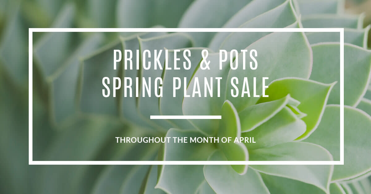
Here’s a look at a couple simple methods to make advertisements and promotional images in PicMonkey. We used our faux succulent and cacti company, Prickles & Pots, in each design.
Use a template

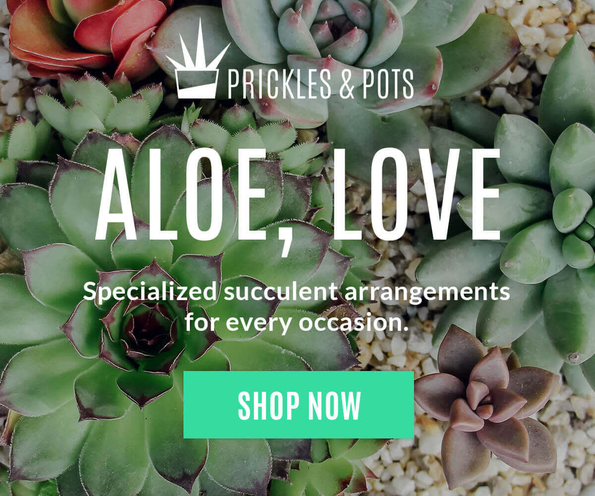
Templates are design lifesavers—they make it easy to get something good looking out the door fast. Here’s a quick look at how to use templates for your advertisements and promotional images, and a little info on how we transformed our Urbique template to make something special for Prickles & Pots.
Browse templates from editor or from our template library.
Find a template that suits your needs, and click Customize.
Swap in your own images by clicking Replace on the Graphics palette.
Customize further by adding your own text, graphics, logo, etc.
Head to Resize in the Basic Edits tab if you want to adjust size.
Your design is autosaved in Hub and you can edit it more anytime!
For a nitty-gritty look at how to use our design templates, watch our short video tutorial.
Tip: If you crave total creative freedom, explore our selection of blank canvas templates and make something from scratch. Just search "Blank" in templates, or select "Blank Canvas" after clicking Create New.
Add text to an image

If you have a photo that perfectly reflects your message or brand, add some text to it and call your design done! Learn more about adding text to images.
There’s no need to forage for a new pic. If you used a magnificent one for your social media covers, in an email, or in a beauteous flatlay, repurpose it and save yourself the trouble of digging up a new photo.
Here’s a look at how to make a text/image combo in PicMonkey:
Open your photo in the editor.
Use the Crop and Resize tools (Basic Edits tab) to give it the proper dimensions.
Apply any essential edits and/or desired photo effects.
Head to the Text tab and add your words.
Add text effects like outline, shadows, or textures if you wish.
Tips: Draw attention to important details (like your call to action, promo codes, and contest-specific hashtags) by making them a different color than the rest of your text. For this design, we emphasized our CTA by bringing in one of our brand colors just for the button.
If your words aren’t looking especially readable on top of your image, try using a graphic. For this design, we placed a black rectangle over our photo, then adjusted the Fade slider on the Graphics palette. This added a little bit of darkness to our entire image and made the text stand out.
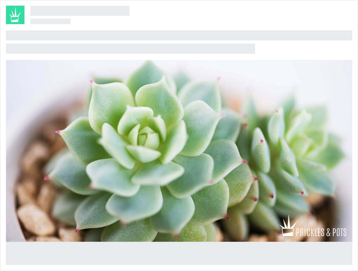
One lil’ note about text/image combos for advertisements: be extra sure to check the guidelines for the site your ad will appear on. Some sites, like Facebook, show more love to ads that feature images with little-or-no text. Learn about making rad Facebook ads. With these, you’ll wanna either keep the text minimal, or go the logo-only route and write your copy to accompany the pic, like this:

Design must-haves
No matter which design route you go, these two rules hold true:
Keep it simple. Too many competing fonts, exclamation points, graphics, etc. will make your design look busy and less professional.
Make it clear. It’s ridiculously important that people know exactly what you’re promoting and what you’re asking them to do. Make your CTAs (either on your images or in accompanying copy) clear and to the point.
Now take a look at your completed design. If it’s looking a little unclear, busy, or off-brand, go back in and edit. This is a process, people!
When your masterpiece is finished and put out into the wild, keep an eye on how it performs, and maybe A/B test a couple versions (you’ll be surprised at how much difference small tweaks can make). Change up the images, tweak the copy, or just try a different CTA to get a handle on what really resonates with your audience.
Well, here we are, at the end of our brand-building journey (dangit, we said we wouldn’t cry!). Thanks for letting us tag along. We’re so proud of you, and we think you should be, too. Enjoy that beauteous, professional brand of yours, and check back with us for more tips and tutorials as you continue to make it bigger and better. Now go make that money!
