Facebook is a wily beast, hard to pin down but vast in its appeal. According to the Pew Research Center, a full 71% of online adults use this social media behemoth. So it’s about time you learned how to tailor your images for Facebook sharing, right?
Follow these tips and guidelines to wrangle your Facebook images like ornery steers, win their respect, and ride into the sunset (also known as “engage your audience with fan-frooping-tabulous images”).
Here’s what we’re gonna cover:
Facebook cover photos (See what we did there?)
Shared images, whether on their own or as featured images on shared links
Image/text combos
Image compression
Facebook cover photos

A Facebook cover photo showing the new creations of an imaginary wedding dress designer.
Taking up what those in the social media biz call “a lot of real estate,” your Facebook cover photo is a primo opportunity to engage audiences. (Though if it were actual real estate, at 851 x 315 pixels it’s not exactly a luxury condo. What is this, a center for ants?!)
“What if I come up with a cover photo that’s all wrong for my brand?” we pretend you asked us.
Not to worry: a Facebook cover photo does not represent a lifetime commitment. In fact, no matter how spectacular your cover photo is, you should still update it every so often to avoid giving the impression that your business has nothing going on. Update your cover photo seasonally, or to promote new products.
There are four ways to easily design a Facebook cover photo in PicMonkey:
Customize a designer-crafted template to get a polished Facebook cover photo in minutes.
Head to our Collage maker and build your cover there, with a selection of readymade Facebook cover layouts.
Go off the grid and design your Facebook cover in a freer-floating format: our Design tool has preset blank Facebook cover canvases that are ready and waiting for your creative genius. Just hover over Design on the PicMonkey homepage, then click Blank canvas.
Crop a gawgeous photo and call it a day! Our Crop tool (in the Basic Edits tab) has a Facebook cover preset, so you can get the right size in two clicks.
Pro tip: 851 x 315 is the size Facebook recommends. However, we’ve found that Facebook cover images look amaaaazing if you double that dimension. (Before you whip out your calculator, that’s 1702 x 630.) Facebook will scale your 1702 x 630 cover down to the right size, plus bonus image quality.
Facebook image posts

This is how a featured image for a link you share will appear on Facebook.

Image-only Facebook posts can be sized up to 1200 x 1200 pixels.
Shared images on Facebook should be sized 1200 x 630 to 1200 x 1200. If you’re only sharing an image, that’s the size range you wanna use.
If you’re sharing a link to an article on your blog, a landing page, your storefront, etc., Facebook will automatically pull in an image, along with a title and description. Since these show up whenever you or anyone else shares the link on Facebook, your featured image should be sized correctly to ensure that it looks as professional as possible. The dimensions for images that accompany link posts are 1200 x 628.
Yes, that’s nearly a 50% reduction in height, and yes, it’s tempting to just post a 1200 x 1200 image and put the link in the caption. But Facebook got wise to this hack a few years ago, and started favoring links shared in the link/featured image format over 1200 x 1200 images shared with a link in the caption. So, to make sure your link gets as much love as possible, optimize your featured images and share them in the link format.
Text/image combos on Facebook

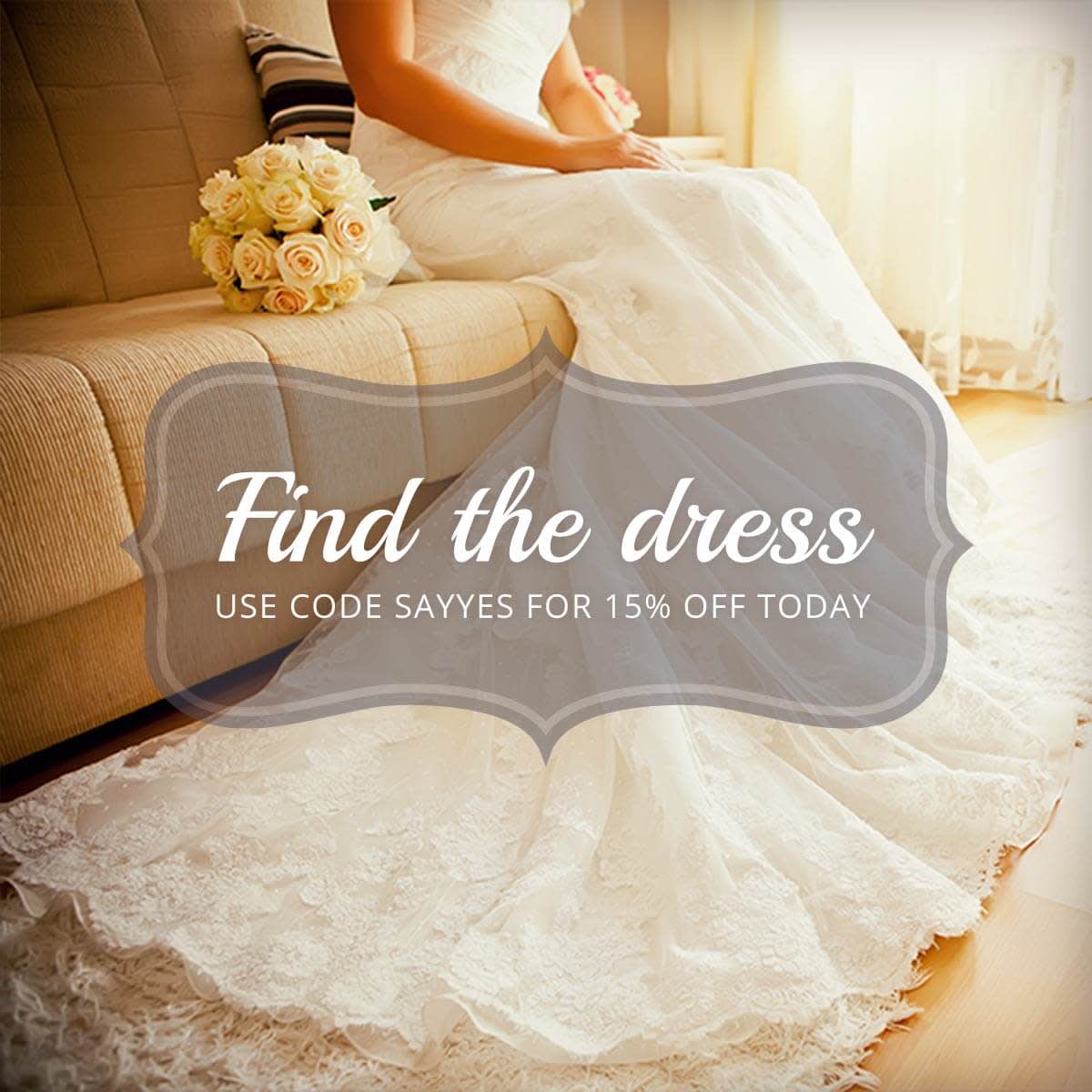
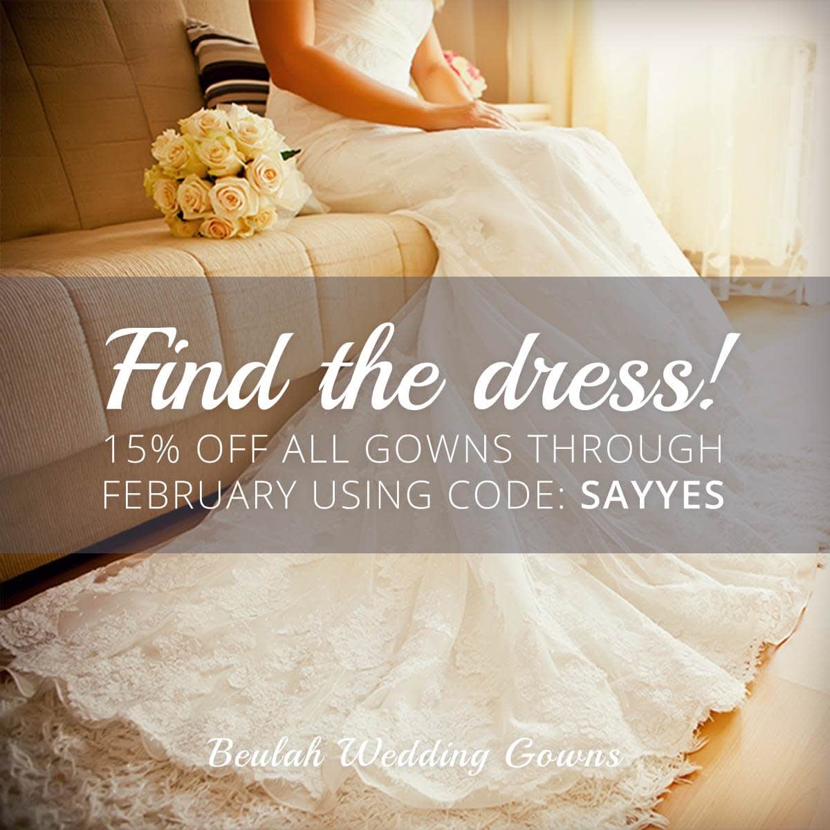
An image that would be a good candidate for use in a promoted post, since it meets Facebook’s ad guidelines.

This image would not be a great candidate for a promoted post, since it features more text. A better option would be to minimize the text on the image and include it in the caption.
Facebook has a unique set of guidelines that applies to ads; ignoring the guidelines could result in a post you paid cold hard cash to promote (or an ad you created) not reaching anyone. It used to be that any text in your image or ad could not take up more than 20% of its total area. If your image featured more than 20% text, it would be rejected. But then Facebook did away with that infamous rule, although not much actually changed. Facebook now has four categories for image/text combos: OK, Low, Medium, and High. The more text you have, the closer you get to High, and the less reach your ad will receive. Images with a High rating may not run.
If you wanna make sure your promoted image/Facebook ad passes muster, put one of our Facebook ad templates to work—they’ve all been optimized to receive as much reach as possible. Then use Facebook’s image/text checking tool to make sure your final design is ready to go.
Compression
When you upload images to Facebook, those images suffer reduction in quality because of Facebook’s lossy compression. Lossy compression, as you may recall from our photo jargon article, is a means of reducing file size by eliminating some of the information it contains. When it comes to images, this information is pixels.
“So what’s the result of lossy compression?” we could have sworn we heard someone whisper from immediately behind us. Reader, was that you?
Hello …?
Lossy compression results in aliasing, or, in more fun parlance, “jaggies”: incongruous stair-step edges that make images look craggy. To retain as much quality as possible, save images at an ultra-high resolution before sharing to Facebook. (A good example of such high resolution is PicMonkey’s Sean setting.)
And for more Facebook/image-y goodness, check out our Facebook image size guide.
