John Bartlett, the guy behind “Bartlett’s Familiar Quotations,” has been rolling over in his grave since quotes ran rampant in the 21st century. You see them framed over doorways, adorning coffee mugs, and flooding your social feed 24/7. Time to get in on this trend and make your own picture quote. We’ve pulled together inspiring examples and design tips to help yours stand apart from the crowd. It’s as easy as…
Go bold or go home with your picture quote

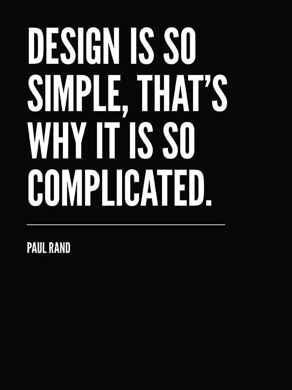
Let your design choices support the meaning of your quote. A clean sans serif typeface, in black and white, underscores the effectiveness of simplicity in design. The bold graphic treatment provides that extra punch that amplifies the message.
Crop for composition

Sometimes your best move, in creating a great composition, is a simple crop. Experiment with cropping to help reduce background noise, create copy space or establish compositional balance.
Match your mood

You’ve seen the “I hate Mondays” meme; the image in this quote pic presents a soothing antidote to the sentiment of the message. Soft tones and transparent text lend to this calming design. To prevent the text from being a distraction, use the eyedropper tool to select a tone from the image and then set the blend mode to Multiply. This darkens the text and allows the image beneath to show through.
Make some space

Geometric shapes create contrast and offset the text from the background image. Play with the Fade slider if you want the shape to be more transparent. Adding an icon, like this bike, to your quote adds visual interest and supports your overall message.
Use scale for impact

Play with scale to add contrast between your text and image. This seemingly vast image of sky and water, when set against the small, simple font, conveys the intended irony in this visual message.
Experiment with negative space

Get this picture quote as a customizable
Negative space can work for your design, supporting the meaning of your quote. The extra white space around the typewriter feels like an isolation chamber, into which deadlines and the pressures of the outside world cannot pass.
