Instagram Highlight Covers (also known as Instagram Story covers) are an important design feature for anyone looking to create a cohesive and visually impactful Instagram profile. And guess what? They're super easy to make yourself!
So let's talk shop. Read on for all things Highlight covers, including:
What are Instagram Highlight covers?
IG Highlights are those fancy little circles that hang out right underneath your IG profile bio. They're a great way to both save and categorize your stories. Creating custom highlight covers is a simple way to polish your brand's look on Instagram.
Do you need a custom cover in order to keep an IG Story past its twenty-four hour curfew? No. However, the default cover for any saved Story is whatever the first image or video is in that Story; meaning, unless said image or video was captured knowing it would be featured as a Highlight cover, there's a risk that your viewers won't totally know what to make of your cover.
Think of Highlight covers like YouTube thumbnails, offering an enticing sneak peek into what your saved Story is all about. At their simplest, they categorize and organize Stories on your profile. At their best, they can supercharge engagement on your profile.
How to make Instagram Highlight covers fast
In a hurry? We got you! Here's the quick 'n easy way to upgrade your Instagram Highlight story.
Open a blank canvas in PicMonkey at the right size that we have preset #picmonkeyhasgotyourback. Select Instagram Story Highlight Cover.
Choose a background color or choose among our stunning stock photos.
Add graphics, text, or whatever you want to represent that highlight.
Customize it with unique brand colors, gradients, and trendy effects.
Download, share, and marvel at the beauty you've created.
Haven't had enough? Us either. Let's jump into some more primo Highlight cover inspo.
How to make Instagram Highlight covers in PicMonkey
Brand your next saved Insta Story in as simple as five steps.
1. Open a blank canvas in PicMonkey
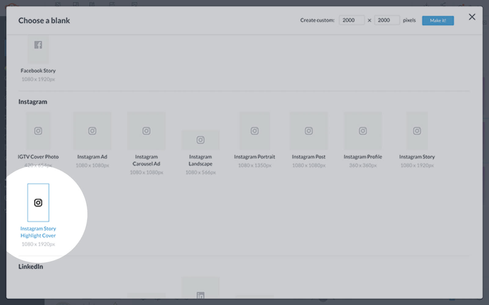
In PicMonkey, scroll down to the Blanks section and click See all blanks. From there you’ll be taken to a page where you can choose your blank canvas size. Select Instagram Story Highlight Cover.
2. Choose a background color
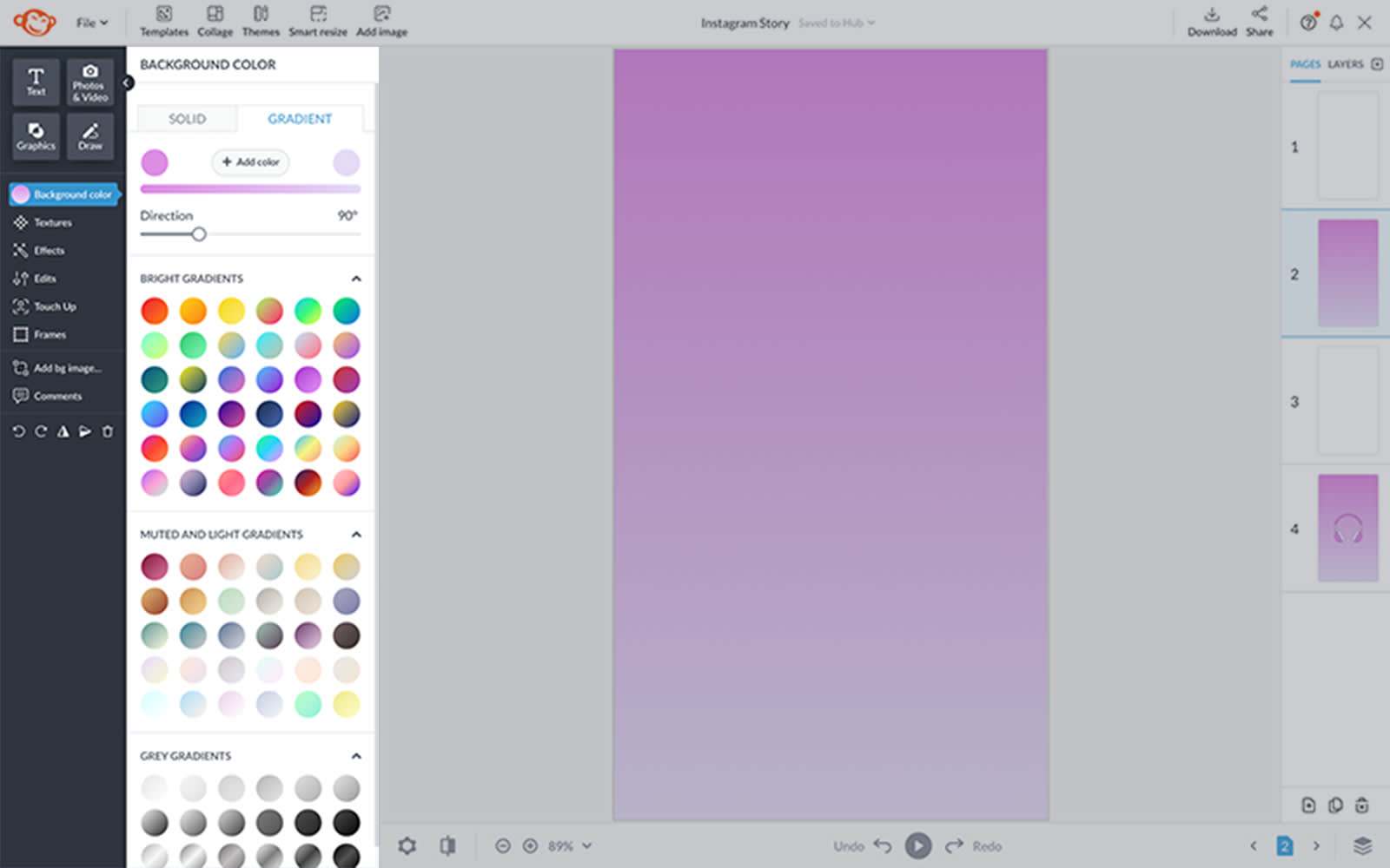
Use the Background Tools menu to select a background color. If you have a branded hex code you want to use, enter it in the text box and click Apply. Otherwise, you can defer to the large selection of common colors or gradient swatches.
3. Add a graphic icon
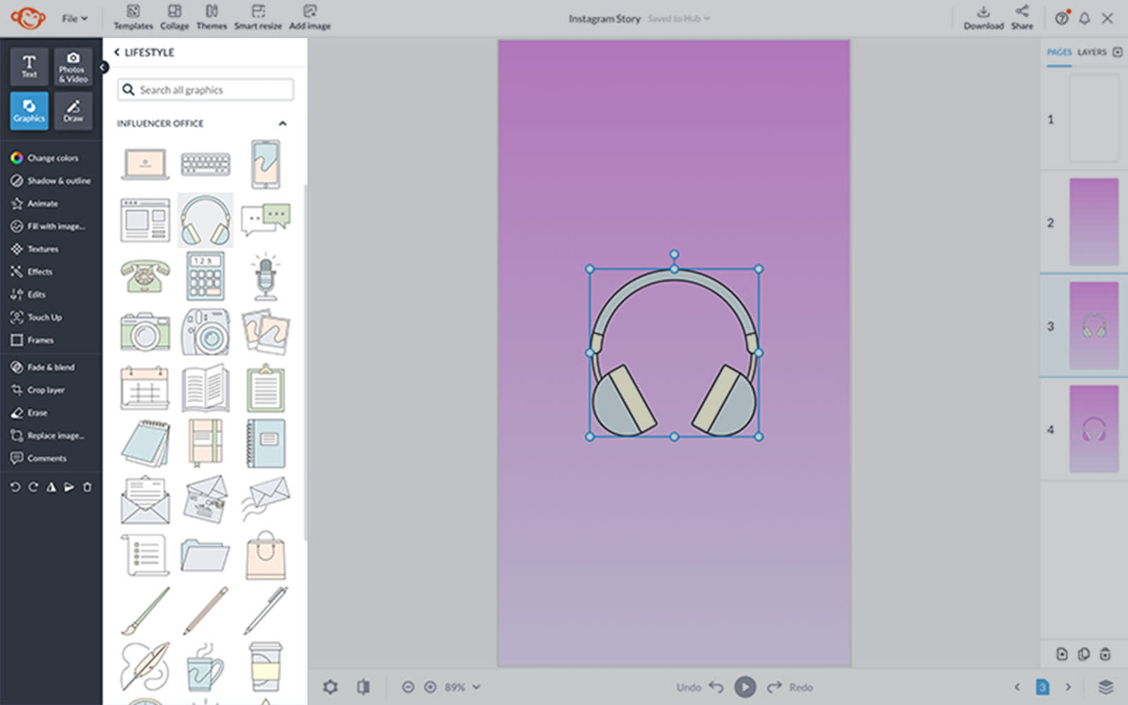
Open the Graphics tab on the left panel to browse thousands of icons, or click Add image on the top toolbar to add your own. (Fun fact: SVG files can be uploaded to PicMonkey, and you can edit colors after uploading!)
4. Customize with colors and effects
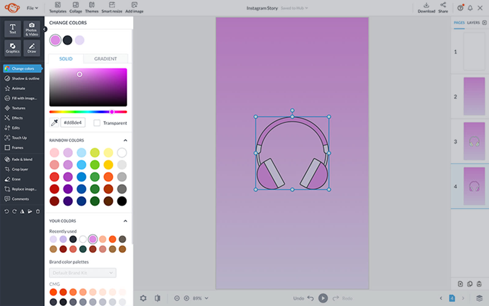
Use the Graphic Tools menu to customize your icon's look. You can rotate, flip, or resize graphics, add shadows or outlines, or...ready for this? Click Fill with image and place an image inside your graphic!
5. Download and share
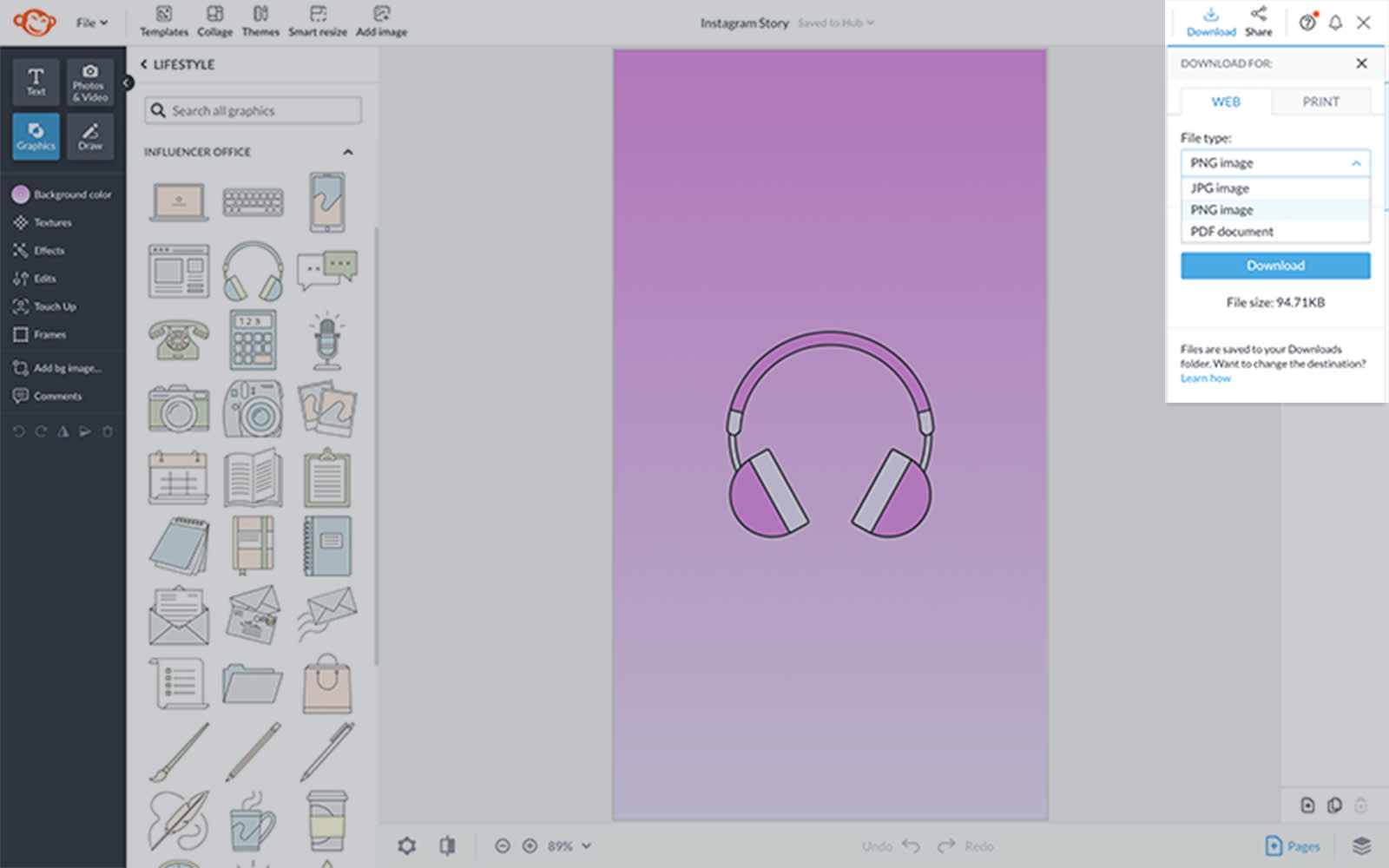
Click Download in the right corner of the top toolbar to save your cover to your computer, then move it over to Instagram when you’re ready. Note that your design always autosaves in Hub, PicMonkey's cloud storage, for unlimited editing.
On the go? Learn how to make IG Story covers with PicMonkey mobile, then download the app and give it a shot yourself!
Uploading your Highlight cover to Instagram
Open Instagram and select the story you want to add a cover to.
Tap More in the bottom right corner.
Tap Edit Highlight > Edit Cover.
Upload your cover design and center within the designated space.
Tap Done to finalize your changes.
Aesthetic Instagram Highlight covers
Know the how but still struggling with the what? Check out this aesthetic inspiration.
1. Subtle food graphics for foodies

Instagram cover icons are crucial attention-getters. Among the billion Instagram users — and 500 million daily users — it's safe to assume a huge portion of those accounts are for designated foodies.
Whether you're a professional chef, amateur, or mere food enthusiast, pair your fave PicMonkey food graphics with a fancy script font and voila! Cue drool-worthy Highlight covers.
Pro Tip: Choose different food graphics to distinguish your Instagram cover icons. Using the same graphic for each category can blur concepts for your audience. In a skim-and-scroll culture, the more diversity you include, the longer people will stick around!
2. Boost moods with color gradients

Color gradients are the perfect way to add dimension and pizzazz to your Instagram Highlight covers. Whether you're a product/service page like @katapaultyourneeds, an EDM music producer, or a trendy influencer, the right colors can impact your mood as well as your followers'.
Curious how? Read all about it here: Use Color Theory to Choose the Best Colors for Your Designs.
Gradients can be subtle or bold depending on your vibe. Need a boost in color? Simply click on the circular Background color icon on the left toolbar in PicMonkey for pre-set and customizable gradient options.
3. Lifestyle icons for lifestyle brands
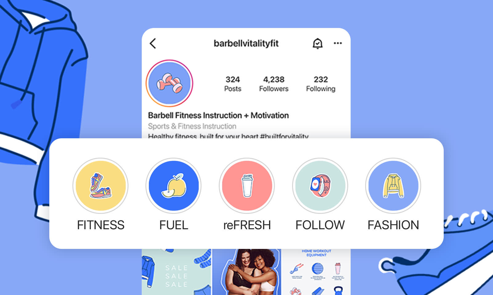
Rockin' a fitness, lifestyle, holistic, or wellness brand? Health brands and businesses are one of the most popular fields to market today. So? Customize your Highlight covers for Instagram with a bold background color and lifestyle-related graphics.
Check out PicMonkey's Lifestyle graphics set and apply your faves to each Instagram cover icon to make your feed stand out like the MVP you are.
4. Get down to business with business icons
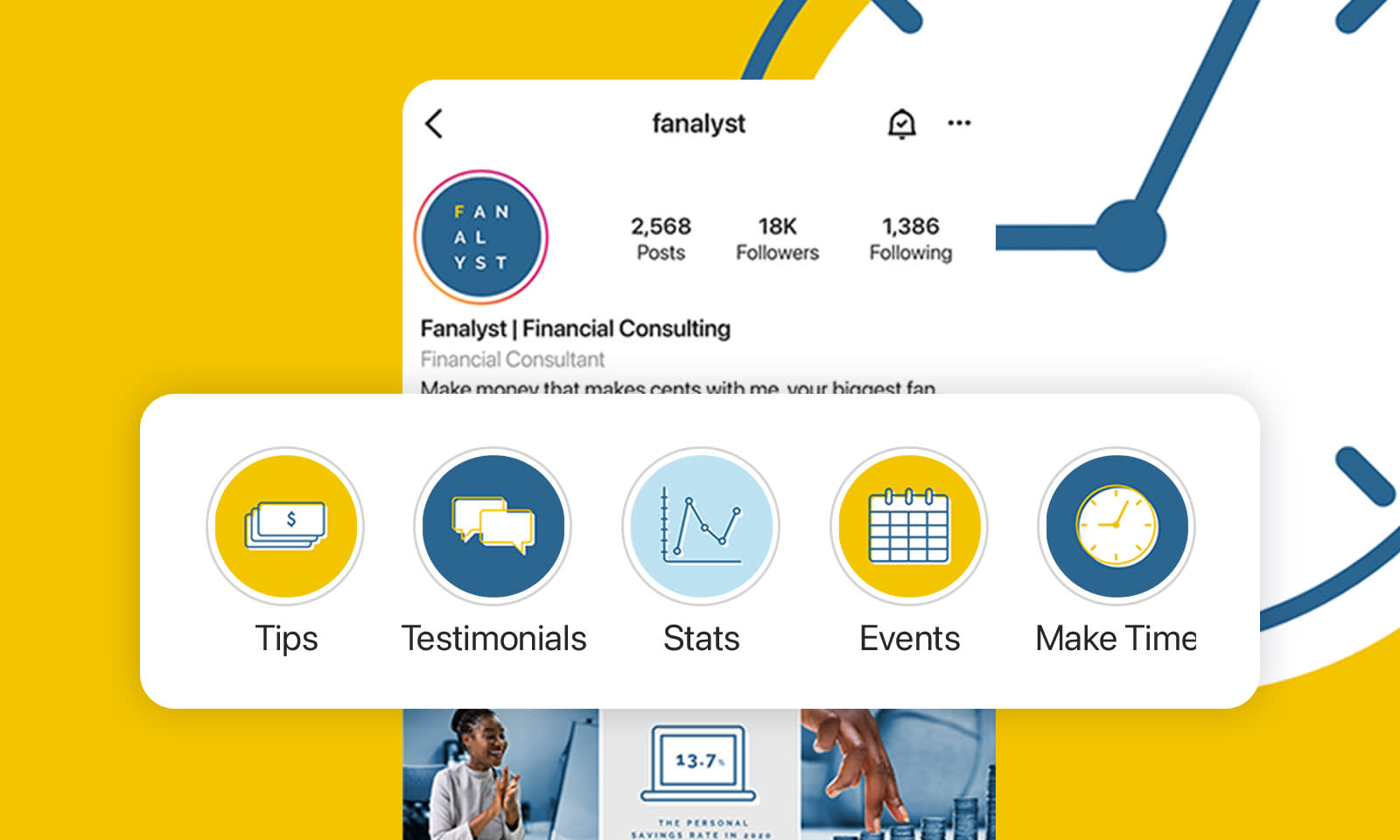
If you're among one of the 582 million entrepreneurs in the world, there's a good chance you also have an Instagram account. Instagram Highlight covers are a great way to attract new clients. Why? They give you the chance to (literally) highlight:
Pertinent info
Testimonials
Statistics
Events
Announcements
Accomplishments
While Instagram story covers aren't a substitute for a website, per se, they're an abbreviated version of one — perfect for our social media driven culture.
Advertising a business through Instagram Highlights is serious in that you want your brand colors and graphics to reflect who you are and what you do. That said, Instagram is innately a playful platform, so it's good to balance that info with fun ways of delivering it.
Pro Tip: If you want to diversify your brand concept or color palette, consider switching it up with secondary color palettes for social!
5. Embody beauty

Accounts like @lunablue epitomize beauty on all levels. Get your mind, body, and spirit on board with radiant Instagram Highlight icons ranging from topical cosmetics to meditative practices.
Notice how the icon colors riff off of the brand color palette (as shown in the logo) while also introducing some secondary color palette shades. If you can capture a style that feels equally predictable as it does unexpected, you're golden, friends.
6. Let your product inspire your Highlight theme
In today's society, asking, "What do you do for a living?" is one of the most commonly asked questions. On Instagram, however, if you have a professional or business account, you don't want people having to ask you this question, otherwise, you may not be struttin' your stuff hard enough.
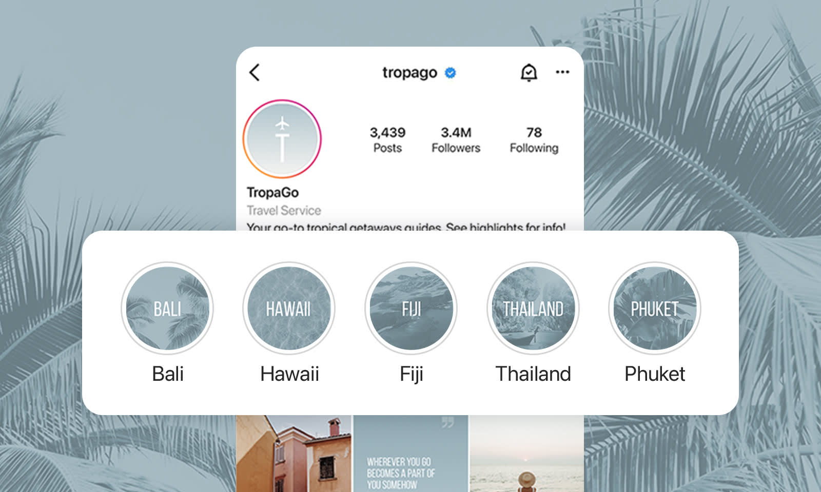
Instagram asks professional account holders to categorize their page by profession. So, we say, why not use that label to your advantage? If you're a travel service like @tropago, why not make travel the theme that dictates font, icon graphics, and overall vibe?
And while you might be thinking, But what about travel do I feature? not to fear! Notice how this account targets tropical geographies. Break up the otherwise overwhelming concept of travel into something digestible for the masses.
Plus! You might notice the cool, calm, collected energy sparked from this shade of blue alongside distinct, tropical, island-related graphics (exhale, ahhhhh). The icons of palm trees, water, and a man pulling a boat are perfect representations of the featured destinations. Subtleties are everything — when done with intention — you capture an audience.
Instagram Highlight cover examples and design tips

Since Highlight covers are super useful for brands, we felt it only right to leave you with some real-life cover examples, plus a few corollary design tips.
1. Make a statement with outlined text
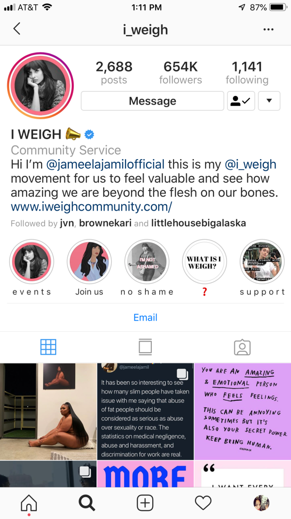
The @i_weigh account uses outlined text in their highlights about not being ashamed. It’s a powerful statement and the text treatment helps to highlight that. The image stays on-brand by using the same pink as the other highlight covers.
Get the look in PicMonkey:
Select your text layer.
Click Shadow & outline on the Text Tools menu and add an outline.
Customize color and use the control sliders to finetune your look.
2. Go for drama with a drop shadow
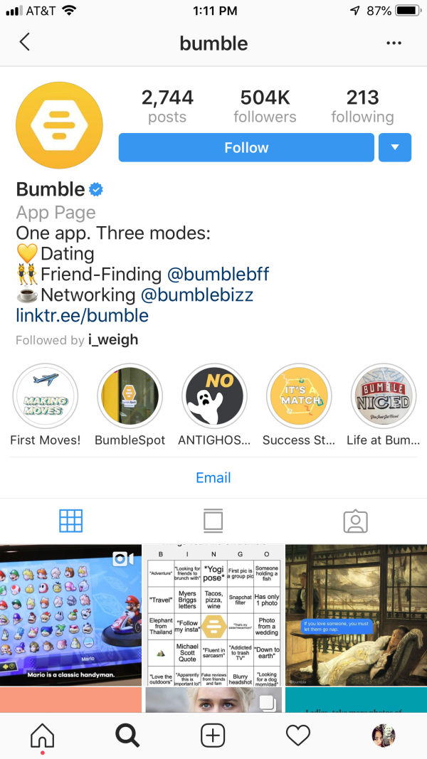
On Bumble's account they have a variety of uniquely branded highlight covers. We’d like to draw your attention to the one labeled “First Moves!” The text has not one, not two, but three drop shadows which help give it a sense of movement.
Get the look in PicMonkey:
Select your text layer.
Click Shadow & outline on the Text Tools menu and add a drop shadow.
Set the Horizontal blur slider to zero.
Duplicate the text layer and change the colors of the text and drop shadow.
Arrange your text layers so that they're slightly off-center from each other. Italicize both layers if you'd like some extra movement.
3. Delight with funky designs

On our IG page (ohheygurl, give us a follow @picmonkey) we’ve got subtle design elements going on right underneath our text. They’re only slightly darker than the background so they add interest without distracting from the copy.
Get the look in PicMonkey:
Start with a text layer against a color background.
Open the Design category in the Graphics tab. Select a graphic and place it slightly off-center from your text.
Use the Eyedropper tool to turn your graphic(s) the exact same color as your background.
Lastly, select your background layer and change its color to a slightly darker shade of your graphic. Voila!
4. Mask text and graphics for a beautiful, dimensional look

Masking is when an image peeks through another image or text. It’s a quick and easy way to immediately add visual interest, like the State of Alaska Tourism Office did on their Instagram page.
Get the look in PicMonkey:
Add text or graphic elements as you wish.
Right-click and select Group layers.
Open the Textures tab and apply a texture to your grouped layers. Your end result: Glorious cohesion.
5. Pump up the party with some ombré

Betches also used a mask over their Instagram highlight cover icons, but theirs is Ombré and it’s fabulous. The beautiful rainbow of colors really pops off that simple black background.
Get the look in PicMonkey:
Highlight your text or icon (whatever element you’re using).
Open the Effects tab and select Ombré. Adjust the Direction and Fade sliders and boom, showtime baby!
6. Stand out with bold icons
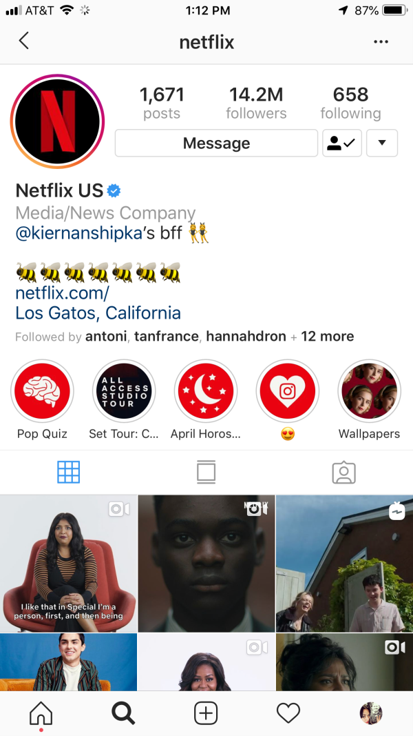
Netflix is keeping things simple by sticking with their red and black brand colors for bold Insta Highlight covers.
Get the look in PicMonkey:
Stick with a dark, rich background color.
Keep any of your chosen icons a clean white. All set!
